GroveStreams Studio is built on a single architectural insight — every cell is a temporal stream. Query results, dashboards, charts, gauges, maps, and pivots all sit on the same foundation: a cell isn't a snapshot, it's a queryable time axis. Hover any cell, anywhere in Studio, to see the history underneath.
GetData — Every Cell is a Temporal Stream
Open GetData on any template and run GS SQL against it — one row per component, one column per stream. Unlike a traditional query grid, every cell carries server-stamped origin metadata pointing back to its underlying temporal stream. Hover any cell to see its recent history. Right-click to drill, edit, or follow foreign keys.
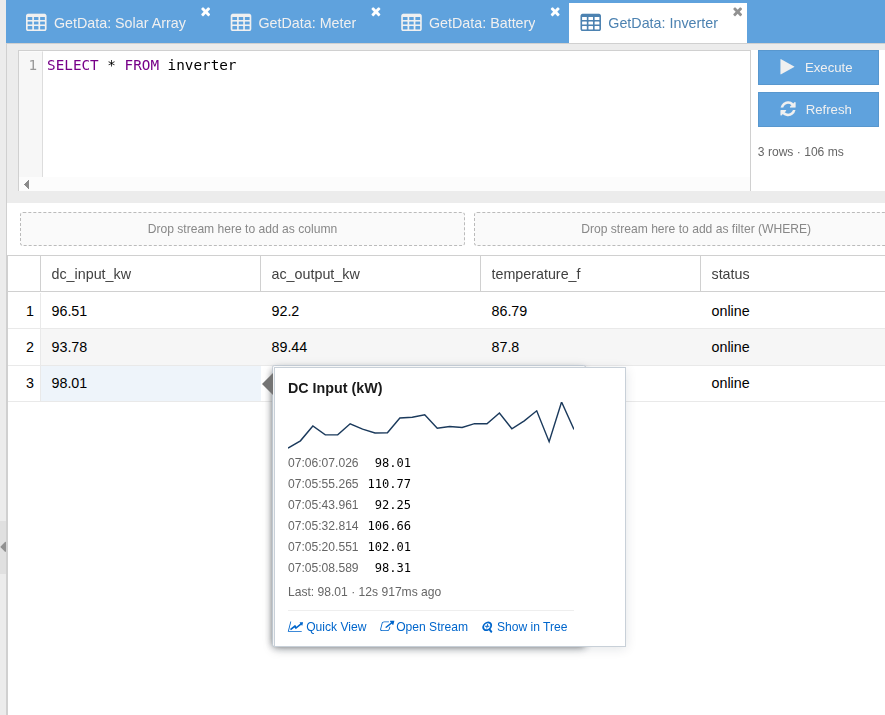
Hover Any Cell — See its Temporal History
Hover surfaces a sparkline plus a recent-samples grid for the cell's stream — without leaving the query result. The popover updates from cached data, so successive hovers in the same row are instant.
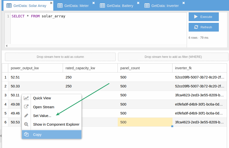
Edit Any Cell — Set Value Writes Back to the Temporal Stream
Right-click Set Value to correct a historical reading at its original sample time or append a new sample. Same ingestion path as the REST API — same RBAC, same audit trail, same downstream derivation and rollup recalculation.
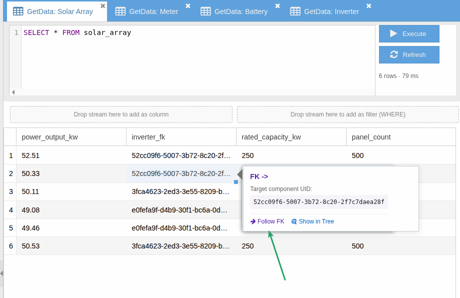
Follow Foreign Keys — Across the Entity Graph
Foreign-key columns are first-class: hover an FK cell, choose Follow FK, and a new GetData tab opens on the target template filtered to that component. Walk relationships one hop at a time.
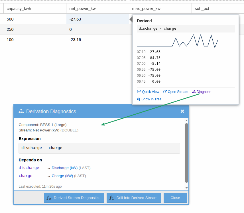
Diagnose Derivations — Right from the Cell
Cells from derived streams carry their expression and dependents inline. Click Diagnose for the full Derivation Diagnostics window — expression source, each dependent's stream (cycle & stat), last-executed time, and a drill-into option to walk the derivation tree.
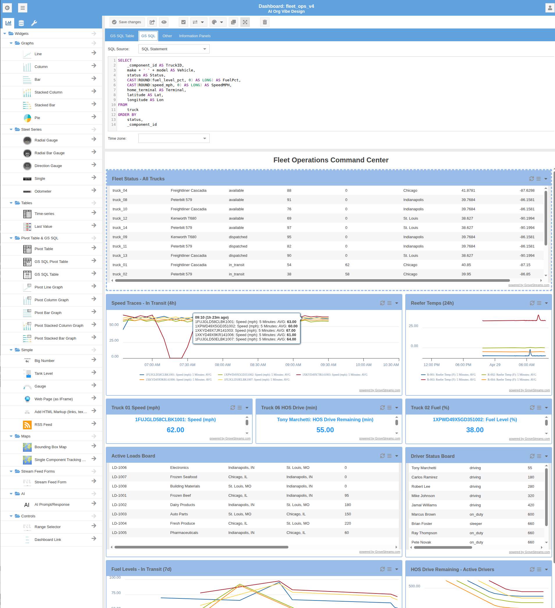
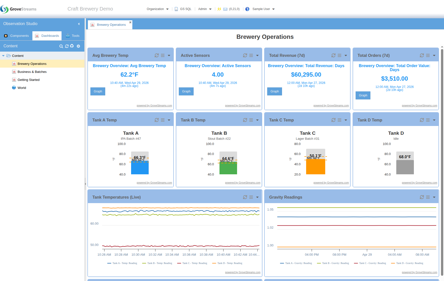
Dashboard Builder
The dashboard builder pairs a widget palette with a drag-and-drop canvas. Compose line charts, gauges, big numbers, tables, maps, and more — all wired to live stream data. Re-skin the result for any operational role with custom colors, layouts, and branding.
Style It Your Way
Custom themes, colors, and layouts — configure the dashboard to match an operational role or brand identity.
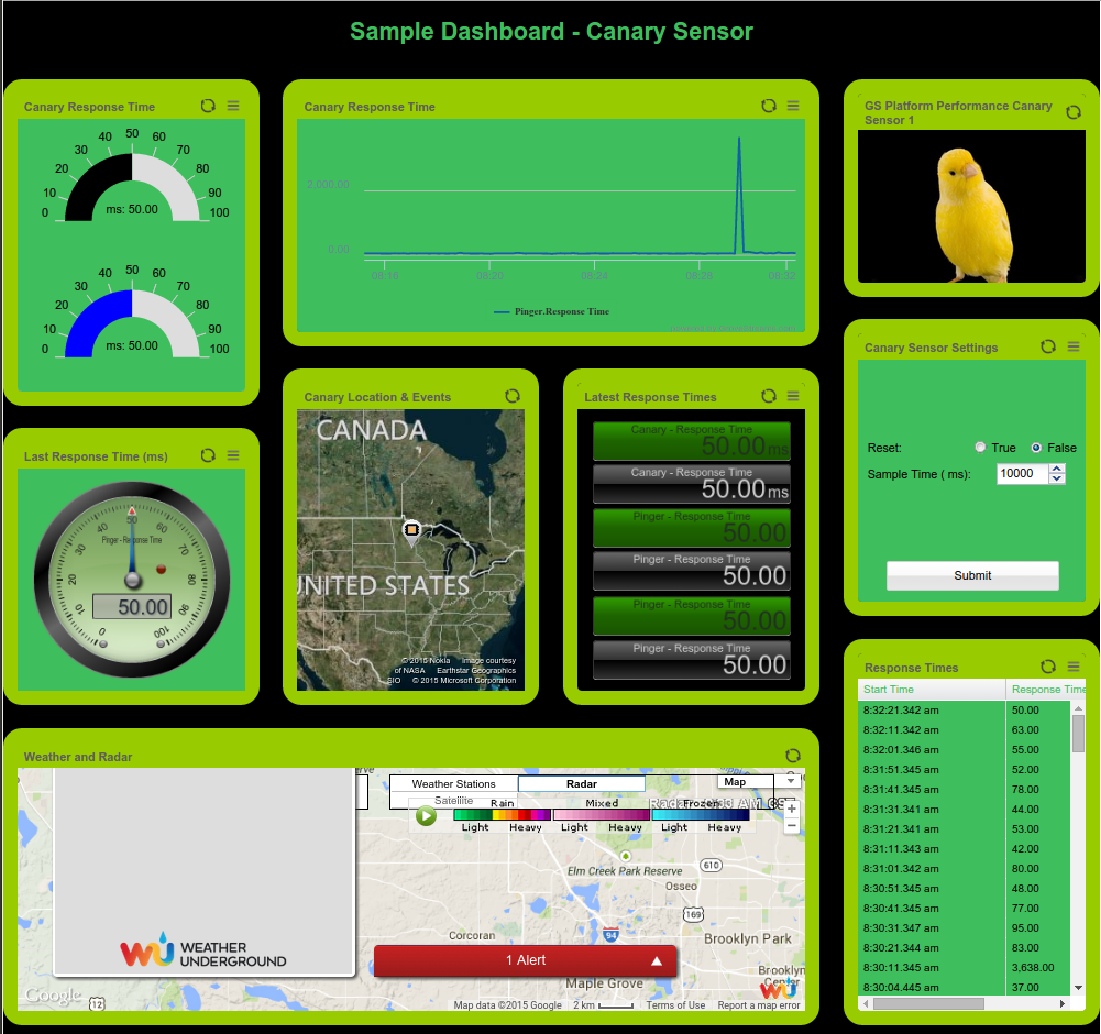
Charts & Gauges
Big-number widgets, gauges, multi-line charts, and trend graphs — all bound to live stream data, with synchronized time ranges and shared zoom across a dashboard.
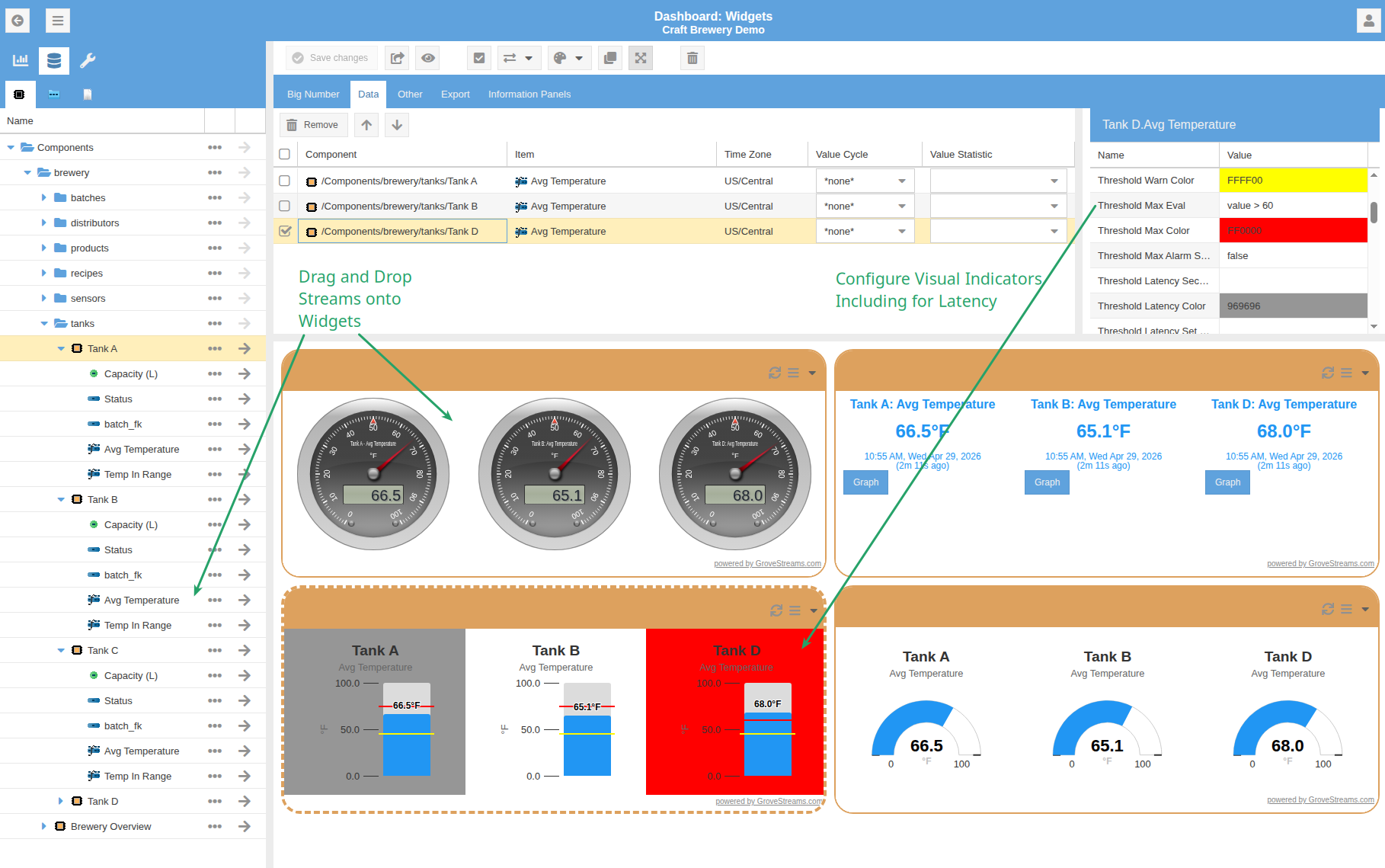
Stream Selection & Drag-and-Drop
Drag streams directly from the component tree onto any widget — steel-series gauges, big-number tiles, level indicators, and plain bar gauges all accept the same drop. Threshold-aware widgets then shift color (green / yellow / red) based on configurable bounds, so the dashboard tells you what's wrong at a glance — including latency thresholds that flag stale data.
Gap Detection
Every stream tracks gaps natively — intervals where samples are missing relative
to the expected cadence. Pick Base Gap Count or Base Non-gap Count
as a roll-up statistic and chart the gap series alongside actuals to spot data-quality
issues at a glance.
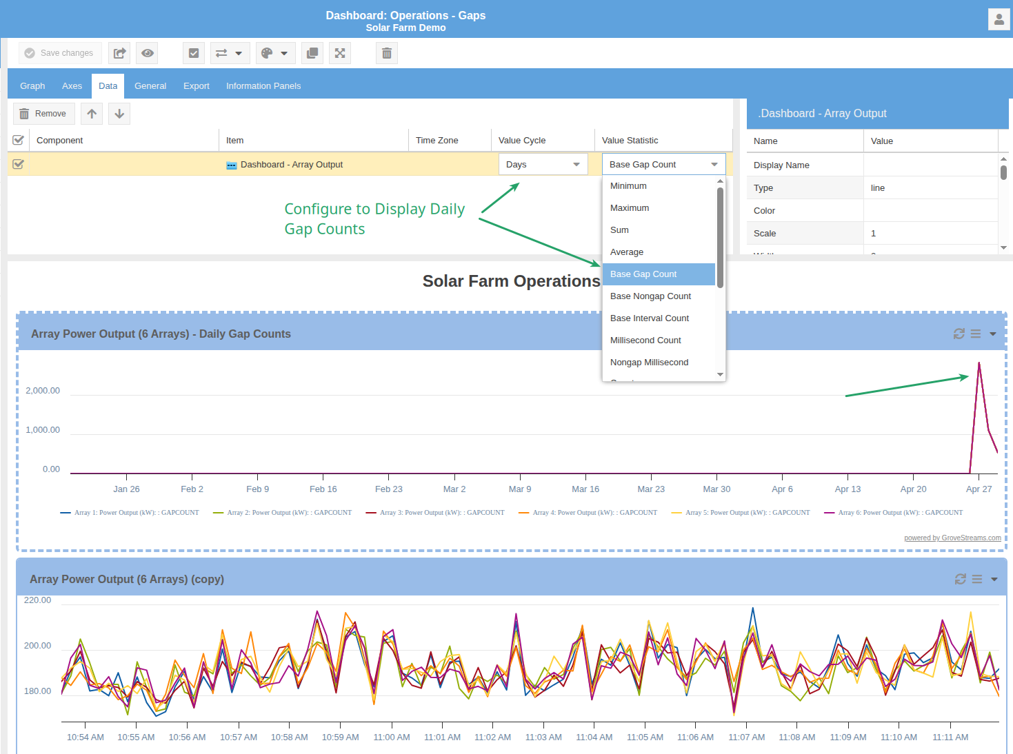
Base Gap Count as the widget's value statistic.Maps
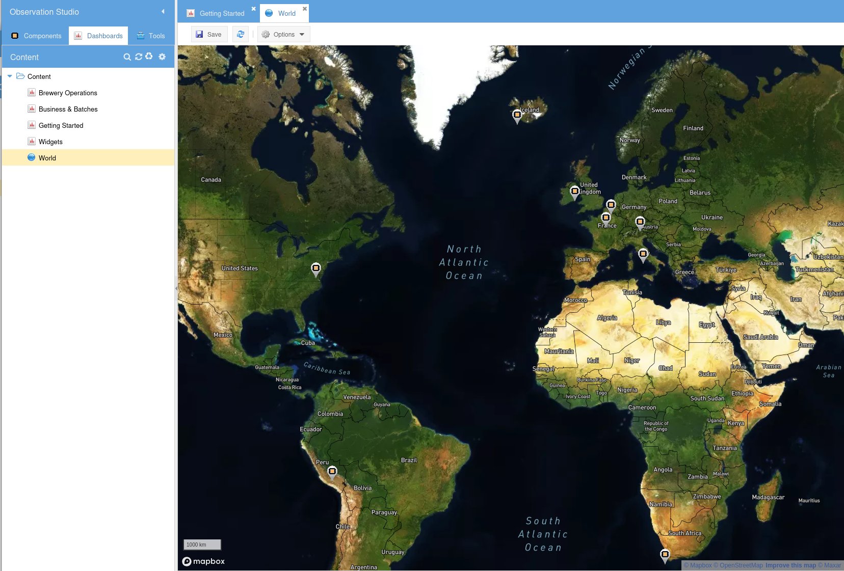
Maps live alongside dashboards in the Content repository. Plot components and event locations across the world; drill into a marker to navigate to its component or trigger an action.
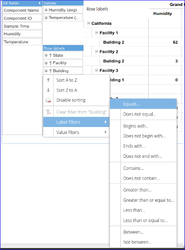
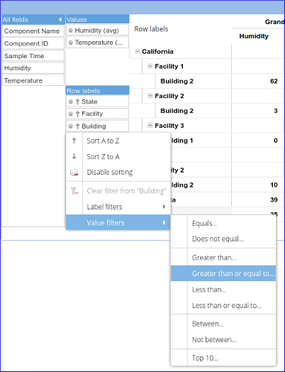
Pivot Tables
Group stream data by any dimension — component, folder, template, time period — and compute sub-totals and grand-totals on the fly.
Pivot Configuration & Chart Integration
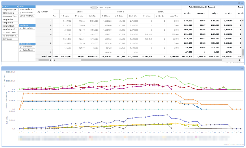
Label & Value Filters
Filter rows by label (Equals, Begins With, Contains, Greater Than, Between…) or by aggregated value (Greater Than, Top N, Between…) — familiar from spreadsheet pivot tables, applied to live stream data.
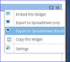
Export
Copy widget contents to the clipboard or export directly to CSV or Excel from the widget menu.